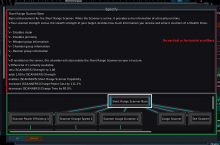
Some chambers need to have quite a long description, but this description is blowing the actual tree out of proportion.
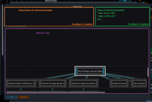
The top section needs to be limited in height and use a vertical scrollbar + text wrapping if the description goes outside its dimensions.
Probably better to split up the actual effects from the description too and give it its own subsection, otherwise they'll be hard to find as the description will always display. You could do them above each other with a horizontal divider in between, but that takes away even more vertical space that.
Current layout:
This would work better:

