4 issues
Issue 1
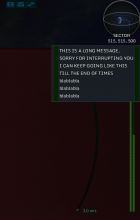
Messages get in front of it. When you need it the most, it's usually obscured. At a high enough resolution, it usually doesn't get in the way. 1600 x 900 though is already small enough where a single message obscures it completely.
Issue 2
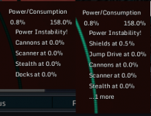
When multiple power consumers need power, the whole list will vary in height and position constantly. Making it one item longer/shorter and it ends up to be unreadable. It also seems to indent differently causing it to jump back and forth.
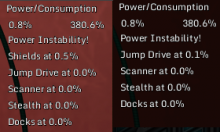
The following example has 3 active consumers in the following priority: Thrusters -> Shields -> Jump Drive. It switches between both constantly when all 3 of these are under constant usage.
Another example would be this one: Thrusters -> Shields -> Cannons. (Jumpdrive is not used here)
Note that there's also 2 different indentations between the 1st and 2nd example.
Issue 3
Related to the 2nd issue, but it seems to display 0% powered in the priority list, even if you're not trying to use them right now.
- Jump Drive
- Scanner
- Stealth
- Docks
Neither of those 4 were in use, yet tried to display all the same.
Issue 4
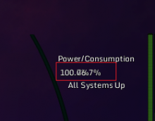
X at Y% usage displays an incorrect percentage, seems it shows the powered decimal and the value * 100.
Example: Something that is ~20% powered will display as 0.2%


