Some weird GUI issues I've noticed so far:
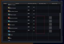
Weapon menu secondary slot has no grey boxes, works fine otherwise.italic text
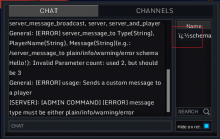
- Chat window displays the admin symbol wrong (should be § I think)
- Chat window move-able divider displays black instead of white. I assume it's with other moveable dividers provided I can find them
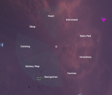
Radial menu has no proper background
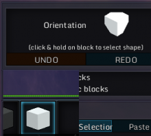
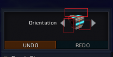
- Block orientation preview has this blackish background instead of the usual white (might be intended, not sure)
- Block orientation preview in build mode "cuts" off at the corners
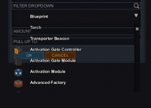
All dropdowns have no background for row items
