Page MenuHomeSchine - Phabricator

Starmade | "Keyboard HUD Icons" remaining issues
Confirmed task for development, Pre-Release Quality AssurancePublic

Description

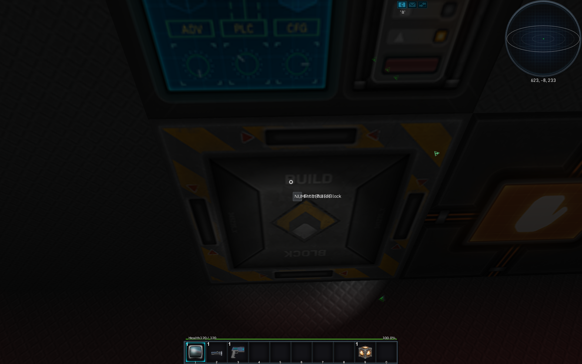
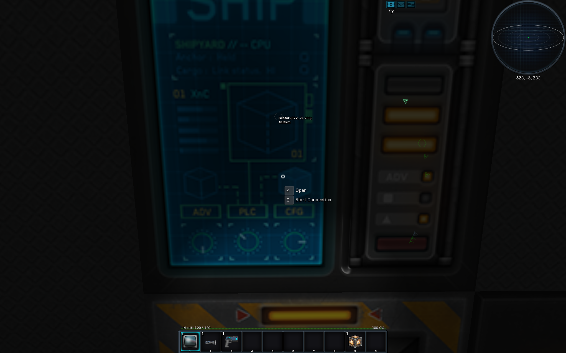
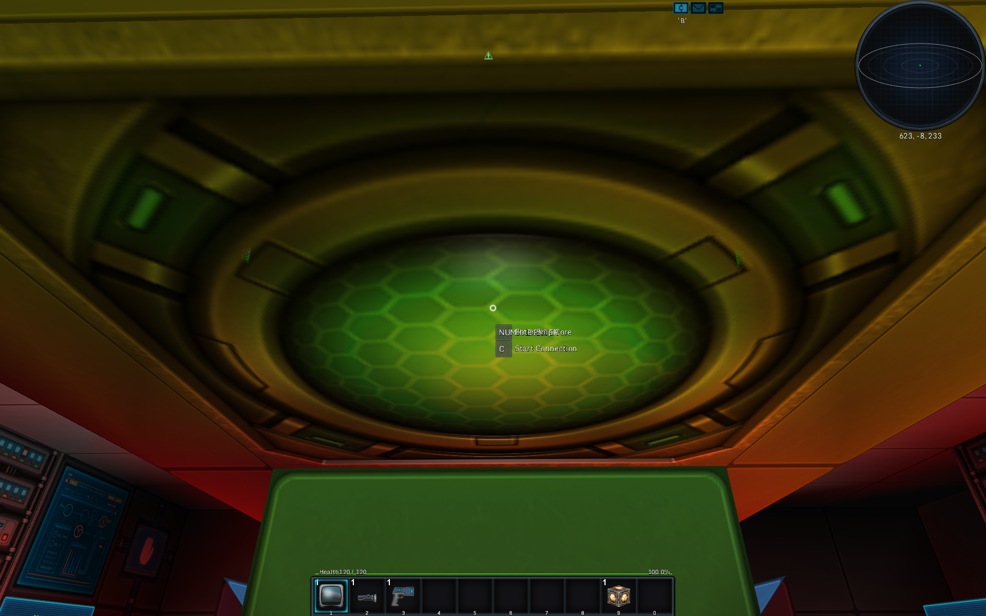
Regardless of the setting of "Keyboard HUD Icons", the ones attached to the crosshair ...crosscircle ...circlehair can not be disabled.
The "Assign" HUD Icon on an empty hotbar slot is also displayed for all values.

At least for a player familiar with the game, this may be unnecessary, annoying, or distracting. If this is actually working as intended and 'None' actually is meant to mean 'Still a few', then please consider adding another step that really means 'None AT ALL'.
For the hotbar icon, it wouldn't be as jarring if it would behave like the regular hotbar labels do - either have it time out, or have them not time out. 'None at all' would still be the preferred option.

Details

Task Type
Bug
Testing Results
Affected Gamemode(s)
Single and Multi
Reproducible
Yes
Last tested (version)
0.200.167
Category
Ingame GUI/HUD
First occurrence (version)
0.200.156
Hardware/Software/System
OS-Specific
No
Hardware-Specific
No
Video Card Vendor
uncertain
Tester information (Internal use only)
  1. Some keys have no placeholder name, and use the long keyboard name for it such as NUMPADENTER, getKeyChar(int mappings) in KeyboardMappings needs to have more cases.
  2. Crucial filter contains needs to have all the left context ones moved to "Most" or another lower level filter.

Event Timeline

Valck created this task.Nov 8 2017, 1:16 AM
lancake added a subscriber: lancake.
lancake claimed this task.

-feedback-

Those that remain, are the crucial ones. Putting it on "none at all" would make you miss out on useful info without the player realizing it.
Examples:

  1. "Set weapon output : (current output)" would not appear for you so you have no idea which one is the output block.
  2. "C start connection" and "V connect with.." so you know which blocks are linkable and which ones aren't. Otherwise you're just guessing
  3. Some information also only appears if you have the block selected on your hotbar (and are in build mode) or are looking at one:
    1. looking at a shield block, shows info about that group near your cursor
    2. looking at power related blocks, shows you info of that group, very useful info

So should all this truly be disabled? [R] to X something was always there before and could also not be disabled. Does it get in the way or?

lancake shifted this object from the S1 Public space to the S3 Starmade space.Nov 11 2017, 12:23 PM
lancake changed the visibility from "Custom Policy" to "Public (No Login Required)".
lancake changed the edit policy from "Task Author" to "Starmade (Project)".

So should all this truly be disabled? [R] to X something was always there before and could also not be disabled. Does it get in the way or?

This is simply not true – '[R] to X' wasn't always there before 0.200, the attached screenshots are from 0.199.654#20170826_140955 aka. the latest 'pre' build, and it wasn't there in any of the 'release' or 'pre' builds before that, either. It would have driven me nuts long ago if it had been.

Obviously it does get in the way, otherwise I wouldn't have reported it, and obviously people were somehow managing to play the game before, even without this 'essential' information.

I think it is a great addition for new players, better than the previous 'help' display, but for at least some people who know their key assignments, it's intrusive and obnoxious.
If you'll forgive the crude metaphors, it's like a baby sibling always trying to tell you what they just learned, which you have mastered years ago, or that bright blue indicator LED on some TVs that's constantly yelling at you 'the TV is on', especially annoying in low-light scenes...

I'm not asking for it all to be permanently disabled, having it set to 'All' by default is perfectly fine, but please give those who don't want that essential information in their face all the time an option to revert back to the (non-)display of 0.199.654.

Would it be so problematic to rename 'None' to 'Essential only' or 'Minimal', and add 'None' as another setting that really does what it says?

screenshots from 0.199.654:


0.200.162 for comparison:


That's because we removed the old "X: do Y" indicators when we replaced them with the ones near your mouse. A mistake on our part since these new context ones used to be there permanently and only later in those dev builds did we add an option to fully turn them off, without realizing the old indicators weren't there to replace them.

and obviously people were somehow managing to play the game before, even without this 'essential' information.

Because the info was always there before the current release (and its pre, dev builds), go back a few more versions and you get this (0.199.402):

Were those old ones better then? I don't recall seeing a single bug report telling me the old ones got in the way, so I imagine they don't get in the way.
Do we need to bring those back and an option to disable them too or?

lancake raised the priority of this task from Normal to Pre-Release Quality Assurance.Nov 13 2017, 4:04 PM
Restricted Application added a subscriber: AndyP. · View Herald TranscriptNov 13 2017, 4:04 PM
Valck added a comment.Nov 13 2017, 6:01 PM

That's because we removed the old "X: do Y" indicators when we replaced them with the ones near your mouse. A mistake on our part since these new context ones used to be there permanently and only later in those dev builds did we add an option to fully turn them off, without realizing the old indicators weren't there to replace them.

I see. I could have sworn they weren't there before that, but...

and obviously people were somehow managing to play the game before, even without this 'essential' information.

Because the info was always there before the current release (and its pre, dev builds), go back a few more versions and you get this (0.199.402):

...you're right, I went back and looked for myself.

Were those old ones better then? I don't recall seeing a single bug report telling me the old ones got in the way, so I imagine they don't get in the way.
Do we need to bring those back and an option to disable them too or?

Yes, from my perspective they were better because
a) they weren't attached to the reticle, so they weren't always in the centre of your view
b) they occupied less screen estate because they were simple, small text, no fancy graphics borders
c) the weren't restricted in area for displaying the key value, see the first and last of the 0.200 screenshots - the text that should be displayed is 'NUMPADENTER' like here, from 0.199.132:

which incidentally also illustrates another bug. - it should be "[Z] to enter", 'NUMPADENTER' is what I have bound to 'Exit Ship'

And yes, please do consider adding an option to completely disable them, even if you revert back to the old model.

Valck added a comment.EditedNov 19 2017, 5:53 AM

Feedback:
First off, thank you for adding the crucial/none setting, it is very helpful in assessing the usability with/without any on-screen indicators.

After some experimentation, my impression is that the most profound impact comes from the text now being attached to the reticle instead of the block you're looking at. I think that is why I was so convinced that the information hadn't been there earlier, when in fact it was - because it was so unobtrusive. It was there when you need it, but it never got in the way. That's what is really different now – in my opinion it's a change for the worse, and given a choice, I'd prefer the way it was before.

I really like the option of "no information" in flight mode because knowing whether a block can be interacted with is a learning process and you may or may not appreciate that reminder, it all comes down to personal preference I guess.
However I agree that in build mode there is dynamic information that is essential, and that can't simply be memorized - "none" isn't really helpful there.
My ideal combination would be "none" in flight mode, and "crucial" in build mode, or "none" with some hotkey that enables the info overlay on demand, similar to the way <shift> works now. Maybe that functionality could be built upon to include the dynamic info?

lancake moved this task from Feedback to Confirmed on the Issue Navigation board.Nov 20 2017, 12:35 PM
lancake changed the task status from Open to In Queue.

Great feedback, you bring up a good point.

I don't really want to differentiate much between ship and build mode, but it should be possible to just move the ones you see in a ship mode to the "most/all" filter, and crucial only has build and block context info. That should remove any info you see in ship mode as long as you have it on "crucial" without taking away all the useful build and astronaut ones.

Bringing the old display method back should be possible, but the lack of visualization of the key (no icon, just text) will make people miss out on it at first, especially since it's not in your face like it is right now.
Not really sure yet what to do with that yet, they're meant to catch your eye, as it's mainly for new players to get to know all of the important and context based info. As soon as you know it by heart, you can tweak the filter to get rid of all but the crucial ones which should in theory be enough.

Putting it in queue for these:

  1. Some keys have no placeholder name, and use the long keyboard name for it such as NUMPADENTER, getKeyChar(int mappings) in KeyboardMappings needs to have more cases.
  2. Crucial filter contains needs to have all the left context ones moved to "Most" or another lower level filter.
Restricted Application edited projects, added Game Development, GUI/HUD; removed Issue Navigation. · View Herald TranscriptNov 20 2017, 12:35 PM
lancake edited Tester information (Internal use only). (Show Details)Nov 20 2017, 12:36 PM
lancake changed Affected Gamemode(s) from none/unspecified to Single and Multi.
lancake changed Reproducible from uncertain to Yes.
lancake changed Last tested (version) from 0.200.156 to 0.200.167.
lancake set First occurrence (version) to 0.200.156.
lancake renamed this task from "Keyboard HUD Icons" set to "None" still shows the ones attached to crosshair and hotbar to "Keyboard HUD Icons" remaining issues.
AndyP moved this task from Backlog / Unclassed to Alpha on the GUI/HUD board.Jan 22 2019, 9:26 AM