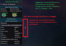
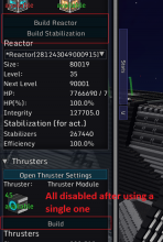
- Biggest issue for me is that it is not clear there is now a toggle button, see image below.
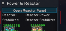
Headers:
- Reactor: Reactor Power, Stabilizer: Reactor Stabilizer, Thruster: Thruster Module and so forth... don't seem to have any purpose. If it is to mention which blocks are relevant to the system group, then this is not needed at all with the actual block icon + tooltip of its name right below it.
Power panel:
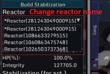
- In the reactor select dropdown box, you see the ID of a reactor which is a bunch of numbers that makes no sense to the player. As you can't give a name to a reactor group, it is still better to have something else in there to distinguish several groups from each other. Use level or block count, examples: Reactor lvl 50, Reactor 50 000 blocks, ...
- Power regen of the selected reactor should be shown here as well, even if it is already in the "stats" panel, it's still important enough to have it here.
Thruster panel:
- Thrust to mass percentage should possibly be displayed as well?
Weapon panels:
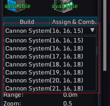
- Same problem as the reactor dropdown box. All these groups with block coordinates don't translate well for a player to figure out which is which. Just mentioning the cannon total size, or its damage would already be more helpful to sort through. For slaved computers, you can mention that in the name as well which should make it stand out more.
- Same for the individual barrels, size and position is probably the best combination, but doesn't really fit on a single line.
- The dropdown selection does not update when you removed the computer(s). It does update fine for the individual group selection though.
- Selecting a slave system, should make it clear it is one and info should be changed to a different format or instead use the same values as the main computer. If it uses the same values as the main computer, the normal stats should probably display a bit more than they do now so that they include the support type, support size, and support % which is partially missing.
Build buttons:
- If you press any of the Build buttons, the Build buttons all disable until you place down a single block. As the button just selects the block in your inventory for simple systems such as Reactor Power, Reactor Stabilizer and Thruster, it really should not disable. Those can be removed completely and have the block icon instead act as a "Select block to build" function. Make the block icon highlight when you go over it to draw attention, clicking it acts like the build button. Could also add a tooltip to it that says "Click to build" in case you want to make it more clear.
- A build button should be disabled if you do not have that block in your inventory. Currently it is active, but if you click it, you get an error message about not having the block.
