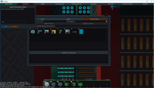
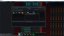
Popup dialogs appear at the top left and although they don't clip with anything, it seems to be the wrong position to draw attention.
It should appear right in the middle, centered to immediately draw your attention.
Its position saves properly but it seems to save individually for each specific dialog which is more tedious than useful.
As I would need to move it for every new dialog type that appears. This isn't exactly much of an issue assuming the default position is good, but it might be better to have popup dialogs all share the same saved position (I vaguely remember it was like that before but could be wrong).
Versus

