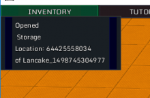
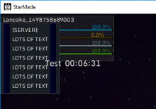
As you can see, it clips a bit through the "Inventory" button there.
Just put the start position a bit lower and it should be fine.
Another thing that could get in the way is the target info, in that case its starting height would need to adapt to it.
It also overlaps with the countdown/shutdown timer but you can just move that one a bit more to the right/bottom.

